For most people, who aren't typography nerds like myself, the name Helvetica may be unfamiliar. But it's probably the world's most popular and most recognized font, used to brand everything from American Apparel to Target to the New York Subway system.
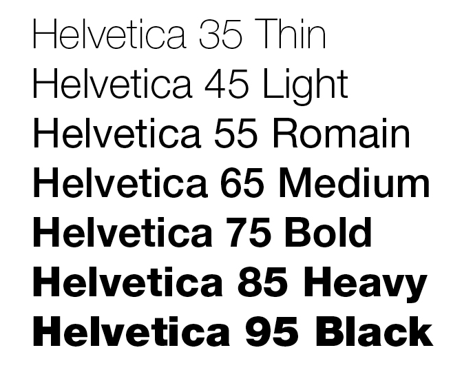
This is Helvetica, for those of you who don't know:
The documentary about which I will write my A2 paper is named for the font and tells the typeface's story as well as its impact on the world.
I originally saw the documentary a few years ago, and was taken with the way the film exposed the deeper impact of the font, discussing a number of designers' takes on both the positive and negative impressions Helvetica inspired.
As I write this paper, I want to decipher what makes the film convincing and why it's effective.
At first thought, the documentary seems to be pretty unbiased, telling both sides of a story that isn't terribly polarizing. But, I watched it again and realized that the effects of Helvetica go much deeper than like or dislike. The typeface changed mainstream design and corporate branding, and did so several times over Helvetica's lifespan.
In the earliest stages of my research, I've read two different movie reviews about the film, from The Village Voice and The New York Times.
This is so interesting! I've never considered exploring fonts and how they effect society. I've also never noticed how many labels and signs all use the same font (Helvetica). In the trailer, 1:04 hit me the most when I saw you could alter the font a bit... never knew that was possible, and those tiny changes are probably why I never noticed that Helvetica is everywhere. I'm definitely going to watch this documentary over winter break. Thanks!
ReplyDelete